THE COLOR BLUE
Why Blue Feels Timeless, And Why This “Neutral” Became My Signature Color
For most of my life, I would have told you I didn’t have a favorite color.
I liked things—a beautiful dress, a well-set table, a room that felt calm—but color itself never felt like something I gravitated toward with any real intention. And then, somewhere between getting married and slowly learning how to make a house feel like a home, I realized something: I was always reaching for blue.
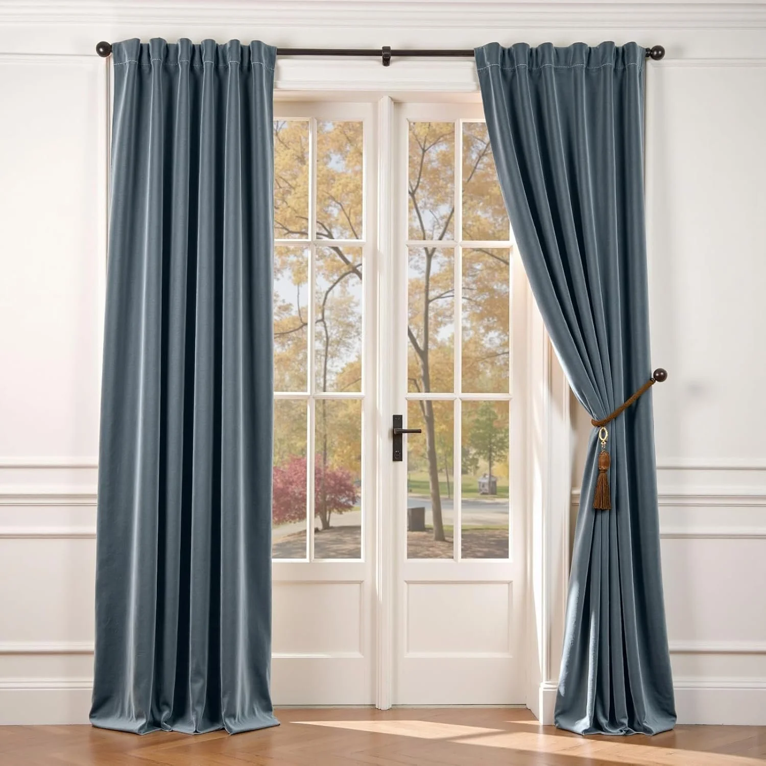
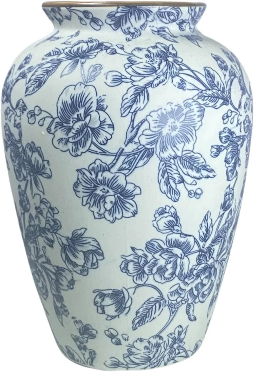
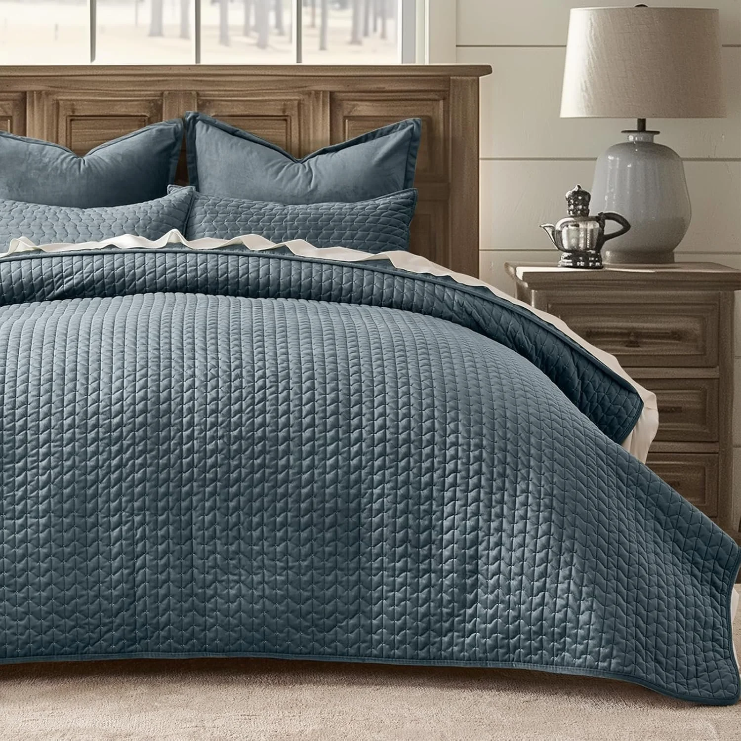
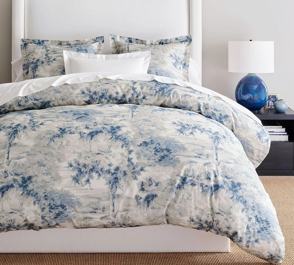
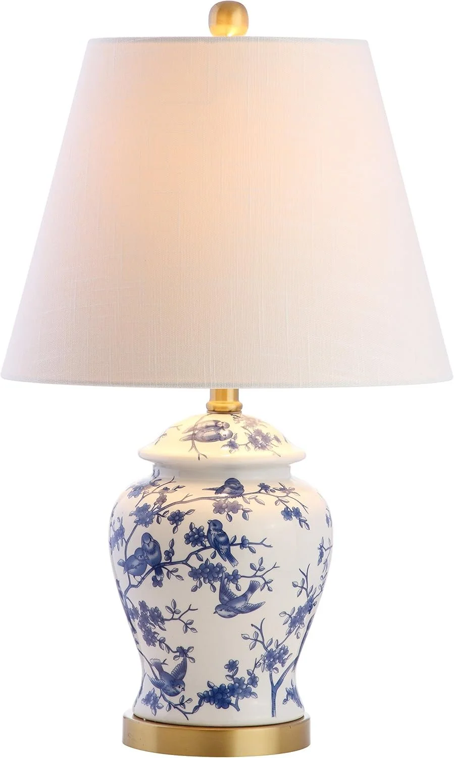
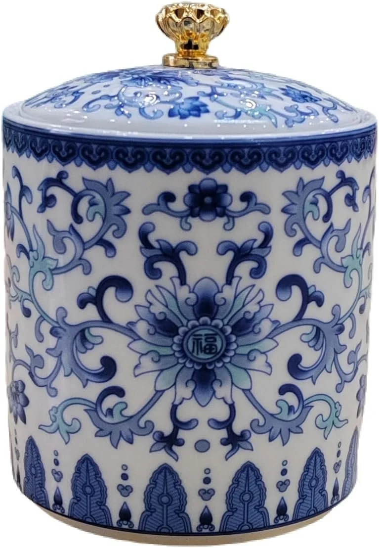
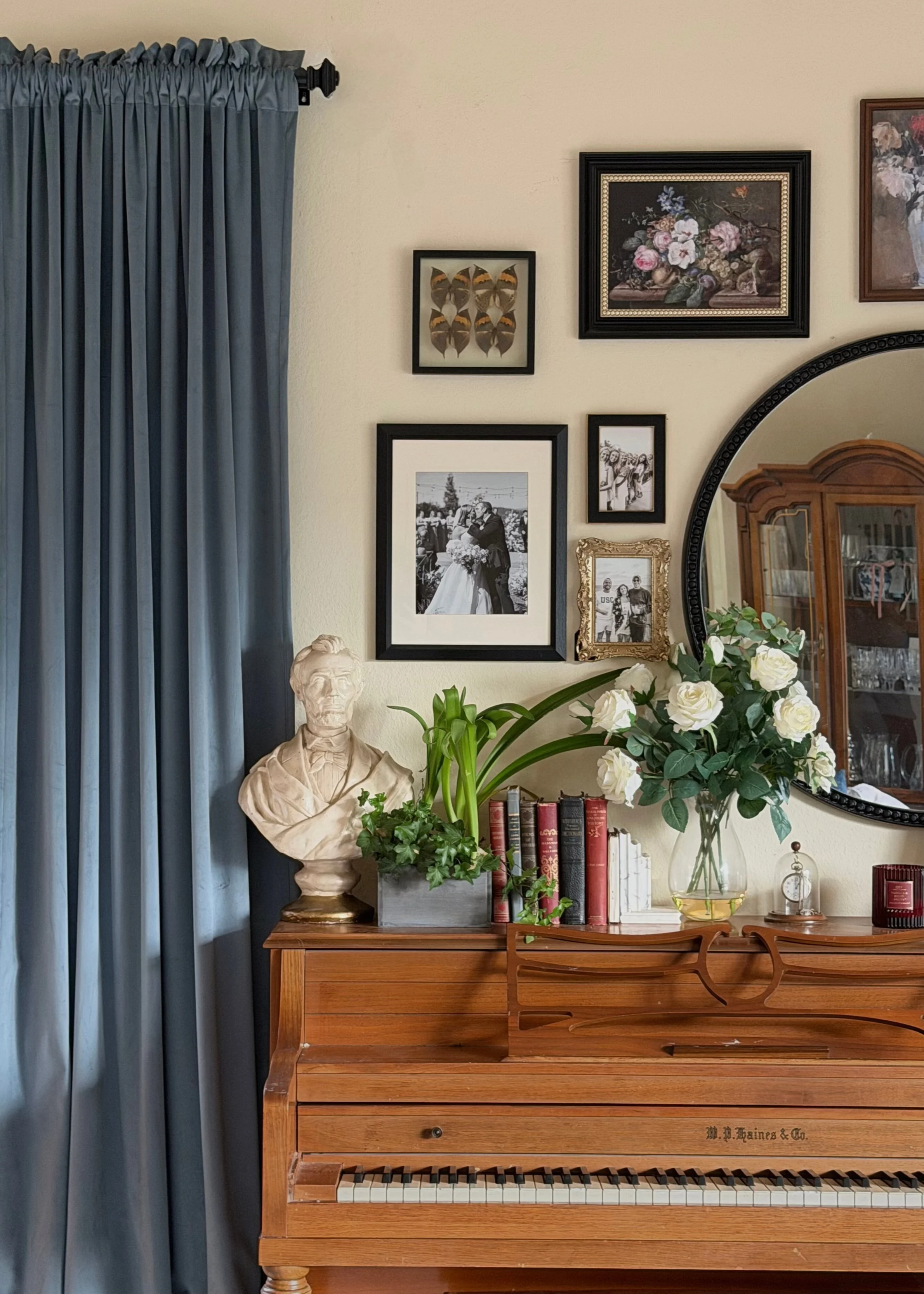
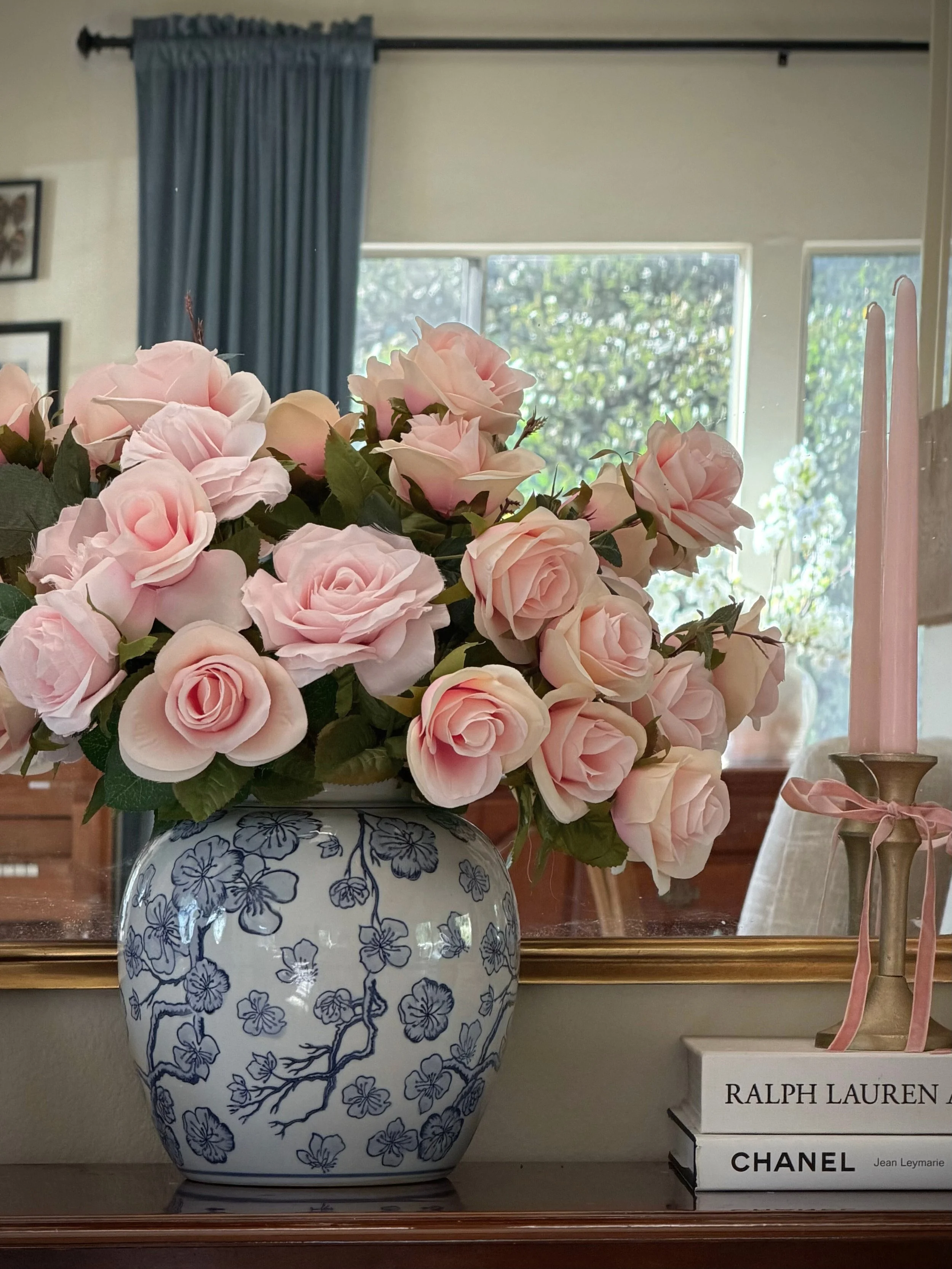
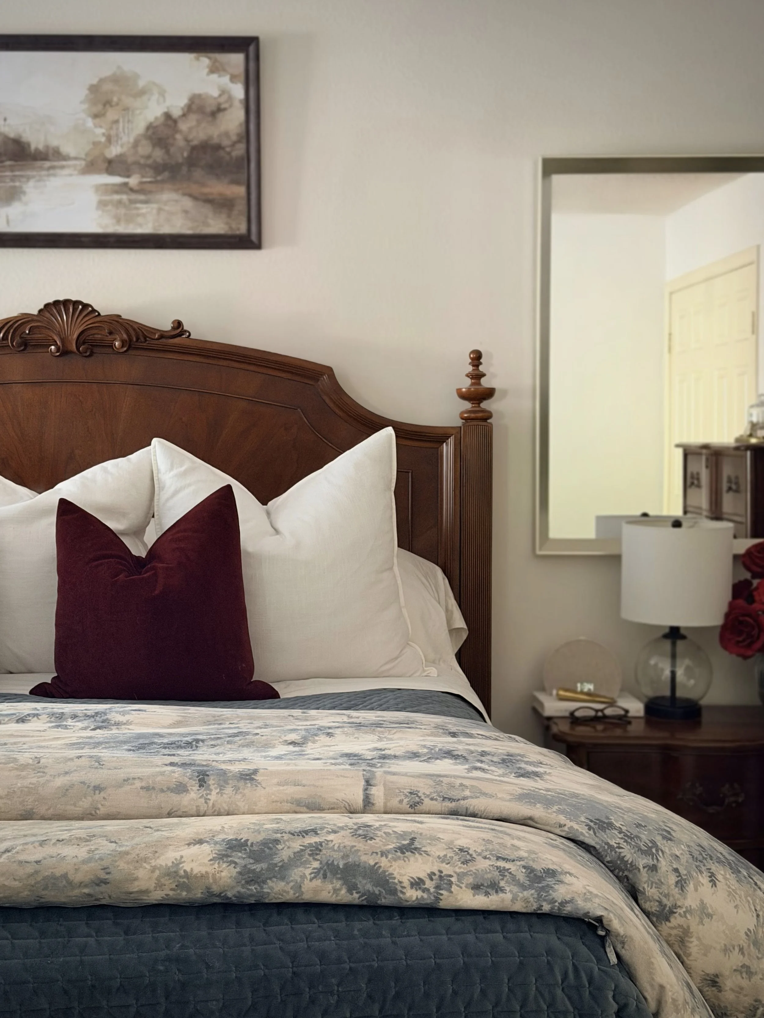
Blue curtains. Blue-and-white vases. Blue patterned bedding. Soft, dusty blues layered in rooms that were otherwise neutral and understated. Without meaning to, blue had quietly become the thread running through our home.
Once I noticed it, I couldn’t unsee it. And naturally, I started to wonder why.
WHY BLUE FEELS TIMELESS, LIVED IN, AND ALWAYS AT HOME
Historically, blue has never been an ordinary color.
For centuries, it was rare, expensive, and deeply symbolic. In early interiors, blue pigments—particularly those derived from lapis lazuli—were so costly they were often reserved for sacred spaces, royal commissions, and the most important details in art and architecture. Blue wasn’t decorative; it was intentional.
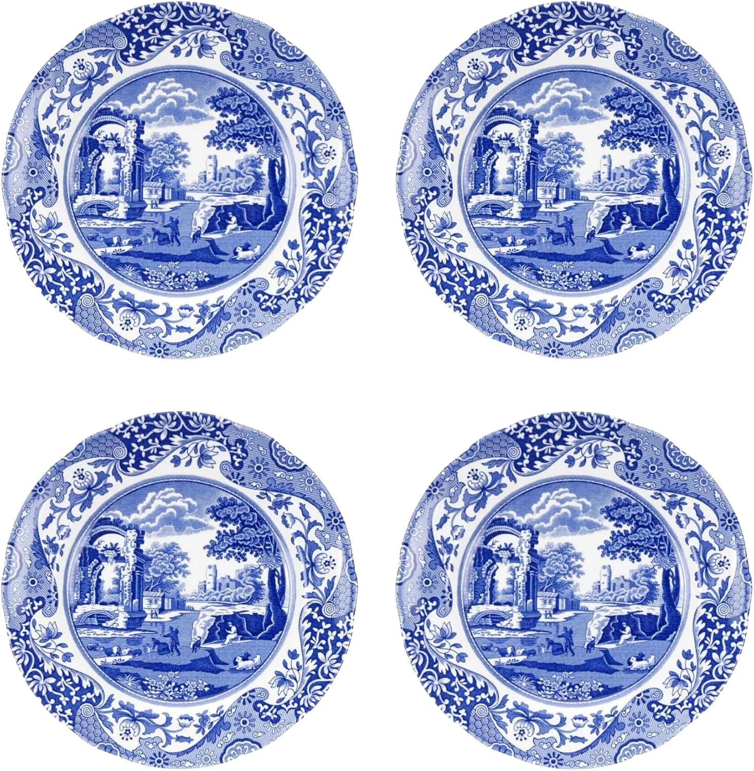
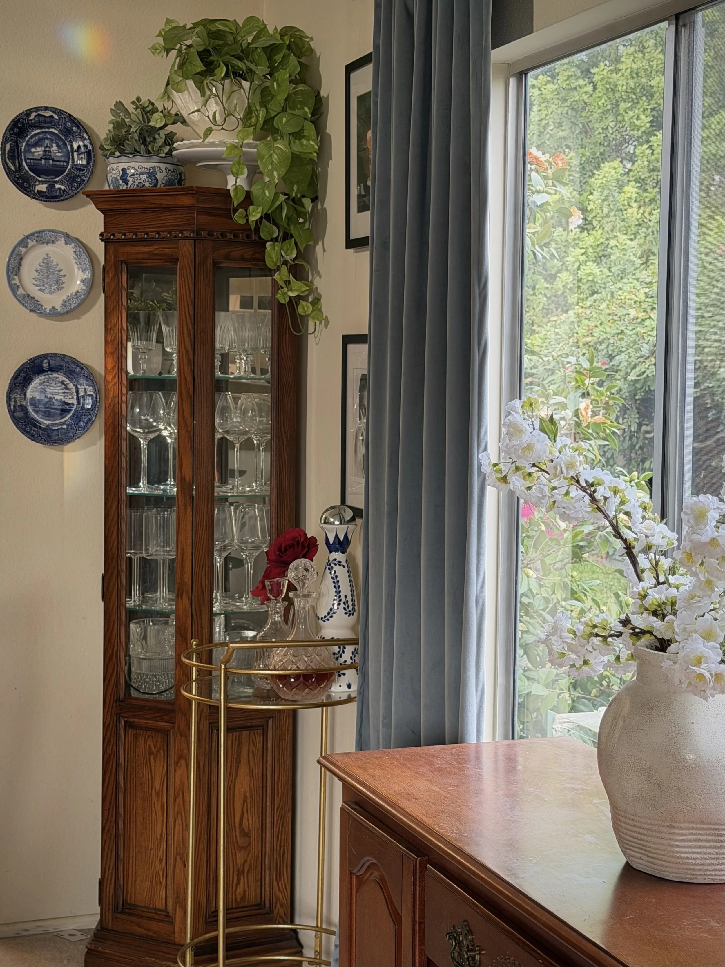
As trade expanded, so did blue’s presence in the home. Indigo-dyed textiles, Delftware ceramics, Chinese export porcelain, and later French and English wallpapers brought blue into domestic spaces in a way that felt refined but approachable. It became a color associated with permanence, craftsmanship, and restraint.
Unlike louder hues, blue didn’t announce itself. It settled in.
That history matters, because even today, blue carries that same quiet authority. It doesn’t chase trends. It doesn’t demand attention. It simply endures.
A COLOR WITH A LONG MEMORY
WHY BLUE WORKS SO WELL IN INTERIORS
Blue has an unusual ability to behave like a neutral while still bringing depth and character to a space.
Soft blues calm a room without flattening it. Deeper blues ground a space without making it feel heavy. Blue pairs effortlessly with warm woods, crisp whites, aged brass, stone, and natural textures—materials that already feel timeless on their own.
And perhaps most importantly, blue ages beautifully.
It looks better as it’s lived with. Sunlight softens it. Layers build around it. It never feels precious or overly styled. It feels collected.
In a home filled with daily life—children, schedules, moments both ordinary and fleeting—blue creates a sense of continuity. It holds the space steady.
WHY BLUE PLAYS SO WELL WITH OTHERS
One of the reasons blue endures in interiors is its remarkable ability to harmonize with other colors—often in ways that feel intuitive rather than contrived.
Blues sit comfortably across a wide spectrum of palettes because they balance both warm and cool elements. Soft, dusty blues lean neutral and calming, while deeper navies and inky tones provide structure and contrast. This makes blue less of a statement color and more of a connector—the thread that quietly pulls a room together.
Blue pairs beautifully with greens, especially those drawn from nature. Together, they feel grounded and organic, echoing landscapes, gardens, and classical interiors where color was inspired by the natural world rather than trends. Blue tempers green’s freshness; green warms blue’s coolness.
With burgundy and wine tones, blue creates a sense of richness and depth. These combinations feel traditional, collected, and slightly moody—in the best way. Think old libraries, tailored upholstery, and rooms that feel layered rather than decorated. Blue keeps deeper reds from feeling heavy or overly formal.
Even purples, when used thoughtfully, find balance alongside blue. Since they share a common base, the pairing feels harmonious rather than bold. Softer plums, lavenders, and aubergines add interest without disrupting the calm that blue establishes.
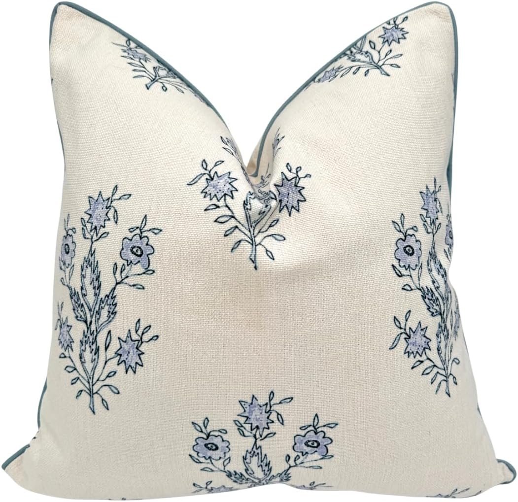
And of course, blue works effortlessly with nearly every neutral—warm whites, creams, linens, beiges, taupes, and especially natural wood tones. In these spaces, blue acts as a quiet contrast, adding dimension while allowing the room to breathe.
Perhaps that’s the secret: blue doesn’t compete. It complements.
What I love most about blue is that it doesn’t try too hard.
It’s elegant without being formal. Familiar without being boring. It feels just as right in a well-worn family room as it does in a carefully styled bedroom or dining space.
In our home, blue shows up again and again: in curtains that frame the light, in bedding that feels calm at the end of the day, in small decorative moments that make a room feel finished rather than staged.
None of it feels trendy. And that’s the point.
Blue isn’t a moment—it’s a foundation.
BLUE AS A NEUTRAL
If you’re drawn to neutral interiors but want something that feels layered and personal, blue is often the easiest place to begin.
You don’t need to commit to a bold wall color or a dramatic piece of furniture. Start small: a vase, a pillow cover, a framed print, a simple textile. Let it sit with you. Let it become familiar.
More often than not, blue doesn’t shout. It whispers—and then stays.
BEGINNING WITH BLUE
I’ve been spending time researching the history and presence of blue in interiors, and soon I’ll be sharing more about how to incorporate blue thoughtfully—whether your style leans traditional, transitional, or somewhere in between.
Until then, consider this an invitation to notice the colors you’re already drawn to. Sometimes, your home knows you better than you think.
FINAL THOUGHTS